
Our Location
304 North Cardinal St.
Dorchester Center, MA 02124
Gloss photographs beautifully and lives badly. Why we seal everything in matte, and the one situation where we'd reconsider.
Gloss is the easy sell. A glossy figure catches the light, looks expensive in a photo, and reads instantly as “finished”. We put a matte clear coat on everything instead, and it comes down to what happens after the photo.
A glossy surface is a mirror with a shape. In a normal room it picks up windows, ceiling lights, and whoever is standing in front of it, and all of that reflection sits on top of the form. On a figure with sculpted detail, reflections break up the shapes you’re supposed to be reading. Cheekbones disappear into a highlight. Recesses go black.
Gloss also shows every handling mark. Oils from a fingertip change the surface tension locally and you get a spot that sits differently under light, and it stays until it’s polished out. On a dark colourway this is constant.
Matte scatters light, so the form is what you see rather than the reflections. Colour reads closer to how it was mixed. Small surface imperfections, the ones that survive even good prep work, stop being visible, because there’s no specular highlight to catch them.
It hides dust worse than gloss does, which is the real cost. A glossy figure can be wiped and a matte one needs a brush, and if you want the detail on that, it’s in How to Clean a Matte Sculpture.
Wet-look elements. Eyes, a glass, a metal bell, a water surface. Those genuinely work better with a local gloss, and we do use a selective gloss on small details where the character calls for it. It’s the difference between a fully glossed figure and one with gloss in three specific places. The first is a showroom trick, the second is a modelling decision.
There’s one more argument for matte, and it’s the practical one. A matte surface is far easier to repair invisibly. A gloss repair has to match not just the colour but the exact sheen, and matching sheen across a patch is harder than matching colour.
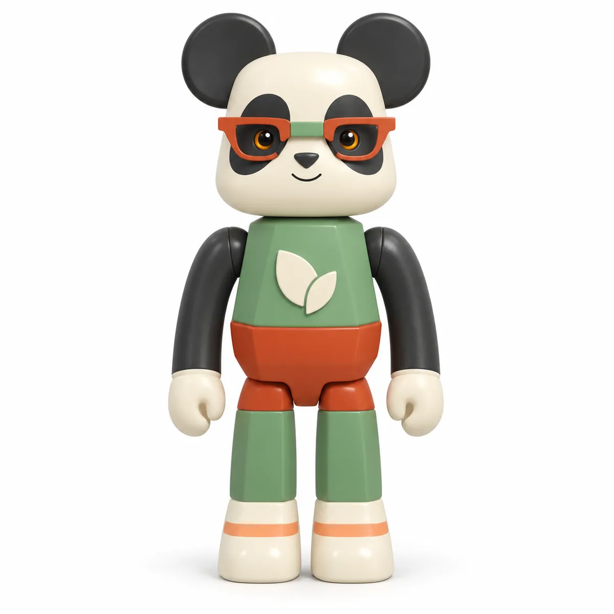
Flat colourways suit matte best of all, since there’s no gradient to distract from the form. Ink Orange Geometric Panda is the piece we point at when someone asks what matte actually buys you.
